
Brand · 7 min read
The Brand Identity Design Process, Explained Step by Step
- Topic
- Brand
- Published
- · 7 min read

Brand identity design
We design brand identities people recognize at a glance and teams can actually run with: strategy, logo system, typography, color, voice, motion and guidelines, delivered as one system. We explore a wide range of directions early, then shape the strongest one into a system your team can use.
What's included
Positioning
Who you serve, what you stand for and the one idea a customer should remember, written plainly enough to repeat.
Mark + wordmark
A primary mark, wordmark and lockups that hold up from a favicon to a billboard.
Visual system
Type pairings, a color system with accessible contrast, and the spacing rules that make layouts feel related.
Language
How the brand sounds, the canonical description, and the headlines and proof points your team will reuse.
Assets
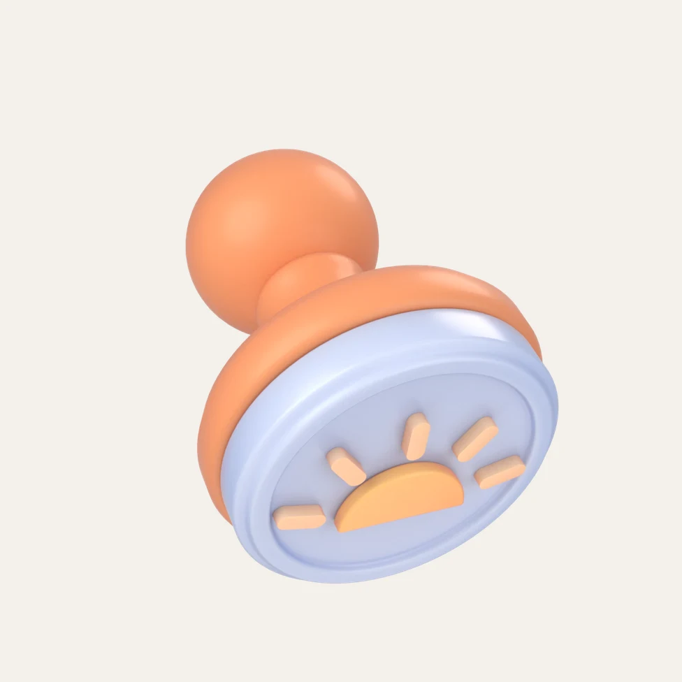
Art direction, soft 3D brand objects and motion principles so the identity moves as well as it sits still.
Documentation
A living guide with the rules, the reasons behind them and ready files, so new work starts inside the brand.
Applications
Decks, social templates, documents and the website system, so the launch is consistent everywhere at once.
Machine chapter
One name, one description and consistent profiles, so search engines and AI assistants describe you correctly.
How we work
Interviews, a competitor and category audit, and a clear read of what your customers already believe about you.
Positioning, personality and the brief every later decision is checked against.
A wide range of visual directions, narrowed to the few worth building.
The chosen direction becomes a full system: logo suite, type, color, motion and real applications.
Guidelines, templates and a rollout plan, plus support while your team starts using it.
Selected work
FAQ
A complete brand identity usually covers strategy and positioning, a logo system, typography, a color palette, imagery or 3D direction, motion principles, voice and messaging, and brand guidelines with templates. The logo is one piece. The system around it is what keeps every touchpoint consistent.
A logo is a single mark. A brand identity is the whole visual and verbal system around it: type, color, imagery, motion, voice and the rules for using them together. A strong logo inside a weak system still produces inconsistent work.
It depends on scope. The biggest drivers are how much strategy and research is needed, whether naming is involved, how many directions we explore and how many applications we design. We agree the timeline in the proposal and share progress every week, so you are never waiting on a big reveal.
Scope drives cost more than anything: the depth of strategy and research, the number of deliverables and applications, whether we build 3D and motion assets, and how many stakeholders need to be involved. We scope each project after a first call rather than quoting from a menu.
Yes. Many projects are an evolution: we keep the equity people already recognize and fix what is holding the brand back, such as a mark that fails at small sizes, a palette with poor contrast, or guidelines nobody uses.
Yes. Brand and web are designed by the same team, so the identity is built with the website in mind from day one. See our web design and development service for how that works.
Further reading
Brand · 7 min read

Brand · 7 min read
AI Search · 8 min read
More services